In Part 2, Rick talks about the challenges facing an industrial designer, how he was thrown in at the deep end after landing a job with Sinclair Research at the start of the home computer revolution, and what he learnt from it all.
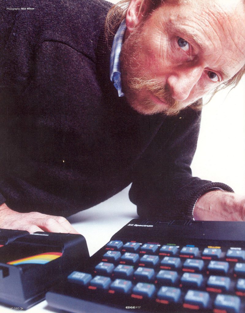
Rick with the ZX Spectrum
Finding the Start
Industrial design is clearly a job which requires high levels of collaboration with others working on a product. Electronics have cooling requirements and cross-talk/electromagnetic interference issues; then there are the demands of plastic manufacturing and tool making; material costs, ergonomics, marketing considerations, assembly line issues and production time scales. From the point of view of an outsider, it seems an impossibly complex role, balancing the needs of so many different people and systems. It begs the question, where do you start?
“The chicken and egg scenario is absolutely what it is,” say Rick. “It is almost like you have to design the whole thing completely to know what it is you are doing and what’s needed, and then go and design it again once you know the answer! It’s an absolute nightmare and there has got to be a starting point for this chicken and egg thing. You begin with a vague notion of what you are doing but you have no idea of the problems you are going to come across.
“I think there are a number of things that come into play and getting the balance right could be what makes some teams more successful than others. But for an industrial designer it is learning to appreciate that there are all these disciplines and you have got to be receptive to what people need. You also rely on people pointing out what they need, one way or another.
“As time goes by, you gradually pick up on all these important things; such as who does what, the general span of their input in a project, and where the fuzzy bits are on the edges where you have to overlap with them. You are always overlapping with one another, but you have got to overlap generously to be sure that there isn’t some really important but subtle thing that falls through.
“Because we were a small team in a small set of offices at King’s Parade, and enthusiastic about our work, we were always talking about it, and that’s how it progressed. When I started there were certainly no formal management meetings taking minutes and wasting time like that. You just got on with it and designed it.”
“Clive was absolutely key and pivotal in every aspect of his business, whether it was checking what stamps went on in the packing room, or cutting deals with Ferranti and finding out what chips the company were planning to develop over the next 20 years. He was amazing in the sense that he knew so much about so many things and I’ve never met anyone like that before or since.
“So Clive was kind of always in the background but I never found his presence obtrusive. He managed the projects, had an idea of what each product was going to be like in terms of the mix of technologies it was using, and how he would get it to the market. He would keep things open with all sorts of fallbacks, so if one thing didn’t work out that was OK. He could say ‘I wasn’t sure it would work, but we can do this as well, if we change something else.’
“Clive also had a very pure approach to design and was very clear about it. I remember being briefed on the TV80 flat screen TV, for example, where Clive, Jim Westwood and I were sat about a glass table. Clive moved the flat-screen cathode-ray tube to the centre of the table and then placed the Fresnel lens in front, explaining that they’d compressed the dimensions of the image because it saved battery power, but re-established that aspect ratio using optics, which obviously doesn’t use any battery power at all. He then placed a little Piezo ceramic speaker in the centre of the table. That was positioned on the other side of the tube so you had the Fresnel and the Piezo speaker side by side.
“Then he got out a flat packet which was a lithium battery that Polaroid used in their instant cameras. I couldn’t believe how many advantages it had. Packing density, for example, and I think it was very good at producing a sudden burst of power. You could draw a lot of current from it and it had a terrific shelf-life. I eventually devised a method of just sliding it out so it was very easy to change the battery.
“Clive just slipped the battery underneath the flat tube and said ‘That’s it. I don’t want anything longer or wider than that,’ and that was my brief. He’d thought it through and it was clear and pure. It wasn’t muddled with little details and incidentals that just weren’t important at the conceptual stage.”
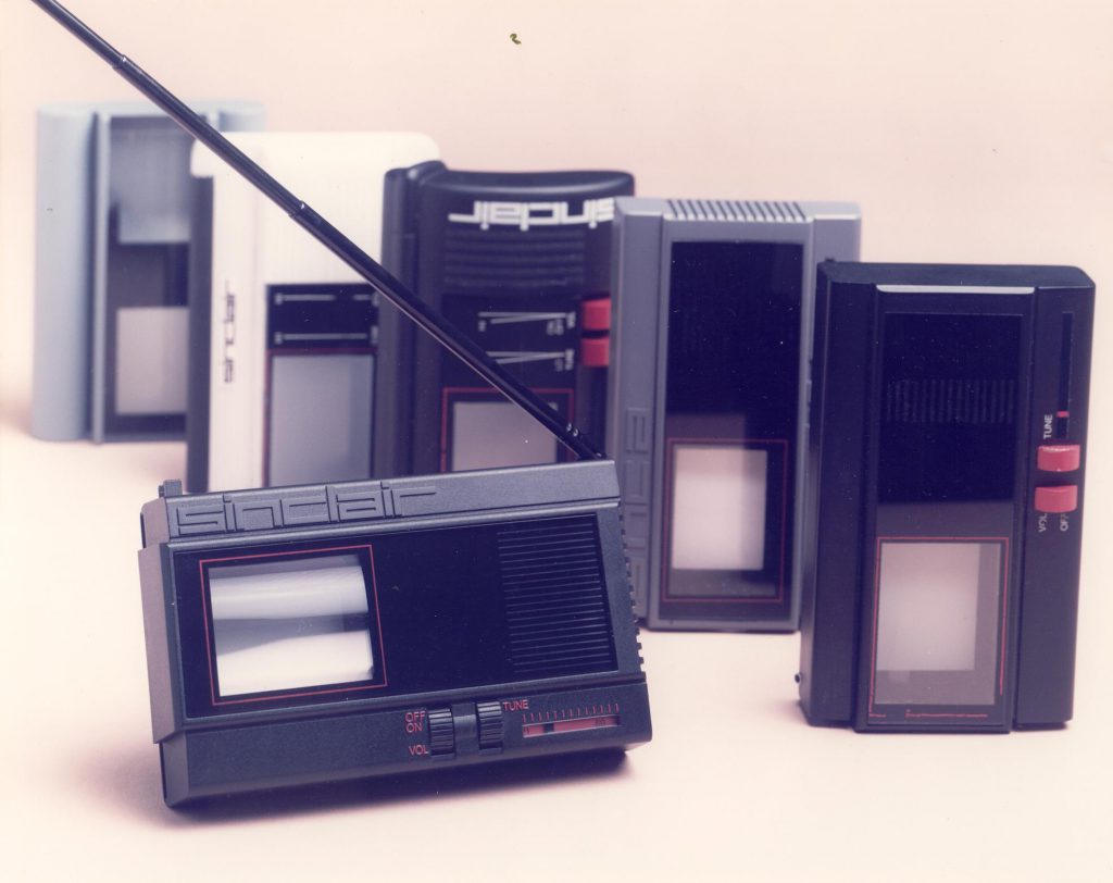
The finished TV80
Form over Function?
Most of us, when we think about the design of an object, immediately consider its aesthetic aspects. Aesthetics are, after all, very apparent. However, much of what the industrial designer is concerned with has little to do with aesthetics, and everything to do with functionality and production. Rick endeavours to explain how form and function are balanced.
“The aesthetic is just one tiny part of it. It’s trying to understand the thing that drives the aesthetics. If you look at a steam railway locomotive, for example, it looks the way it does because of everything it has to do. The size of the wheels gives it a certain type of gearing, the boiler shape determines how well it will perform, and so on. Then there’s the ergonomic consideration for the human operator.
“So, where’s the aesthetic design in a locomotive? I know you have the likes of Raymond Loewy, who streamlined locomotives in the States, but he was very smart. He would have realized where there was opportunity and where there was not. It’s got to be an integrated business, so whatever you see on the outside relates entirely to everything else. You’ve got to deal with all sorts of nasty things like, say, an exhaust stack. You know the exhaust has got to come to the outside somewhere and its going to pass through the lovely casing. It just happens to be positioned there because of the engine. And it is also moving, because the machinery is moving differentially to the body shape around it. So you have to have a gap of a certain size, which isn’t going to be pretty. And if it’s hot you might need a different material around it.
“So these are really difficult engineering problems which have a massive aesthetic impact and I just don’t see how people can work on aesthetics without understanding everything there is about what is happening, on, in and beneath the surface.”
The materials an industrial designer chooses also affect the aesthetic and tactile characteristics of a product, as does the way the materials are moulded, cut, joined and finished. Nevertheless, the appearance is only one reason for picking a material and treating it a particular way.
“There is also the matter of understanding the different materials and how you are going to form them,” says Rick. “Are you casting the metal or folding it? Is it a mono curve or a compound curve? Is it going to stretch and how do you join these things and deal with heat and differential thermal expansion? What is the affect on a person who touches it? Is it going to be so hot they burn? If so, do you have to add something that is an insulator? How do you fasten it? Do you screw, nail, glue or clip it in place? The list goes on forever.
“We started a project recently and there is no room for what you might call styling and aesthetics, and barely any room to move on ergonomics because it is so functionally driven by things you can’t even see. There can be considerations like electromagnetic radiation or a thermal problem. Or we might need to get two models out of one set of parts so there is an up market one and a reduced one, and all of that just adds another layer of variables which are compromising your design – everything is a compromise.
“For example, if you look at compact digital camera which is technically waterproof, it will have an IP code such as IP67 or IP68. That tells you that you can lower it into your beer and it will still take a photograph. Compare it to one that isn’t waterproof and you’ll find the user interface is completely different. It won’t have nice little buttons; it will probably have a sealed keypad and won’t feel or look as nice. The lens won’t extend out of the front of the face; it will be cleverly built behind a waterproof screen. There won’t be a way of connecting to it because waterproof connectors cost a fortune and are large, so you will find that the only way you can charge it up is to take the battery out. That’s because it is easier and cheaper to put a seal around a removable battery lid than fitting a connector.
“As a consumer you don’t know about these things, but you might not like the feel or the look of it. We’ll, that’s tough because it’s the only way it can be made waterproof, so you’ve got to accept that.”
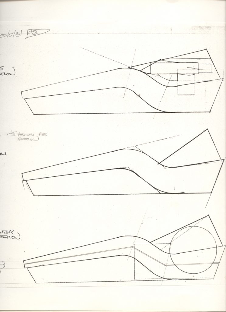
Rick: “Sectional views through early QL concept showing the issues of accomodating (from top down) microdrive, display and printer paper roll. You have to understand the mechanical implementation of internal parts and devices first, then the ergonomics of these in isolation and combined into a single product.”
From Prototype to Production
Designing a one-off product which works perfectly well is not necessarily difficult, as all its parts can be made in a bespoke fashion at the expense of time and cost. Designing a mass production version of the same thing, however, takes a huge amount of extra work, and might not even be possible. Sinclair, for example, premiered his first working prototype of a miniature television at the 1966 Radio and Television Show, but it took another 10 years to produce a mass production version, namely the TV1A and later the more affordable TV1B. Rick explains some of the issues faced when designing for mass production at Sinclair.
“At Sinclair, cost was the enemy all the time. The problem was making the product affordable and attractive and trying to save money. It is very easy to design a product that works quite well if you are not bothered about how much it is going to cost to make or tool, but to come up with a solution that fulfils all the requirements and costs less money to manufacture is really quite difficult.
“Everything that happened at Sinclair was new. That’s very difficult, from a product design standpoint, because there are no references for how it might end up looking and how you’d use it. There was no point going to the shops to look at examples because there were no references – it hadn’t been done before. There can’t be many people who find themselves in that position. If you take the likes of Apple out of the equation, it’s all been done before, largely.
“And Sinclair wasn’t just coming up with new products that hadn’t been done before, he was also finding new ways of doing things, which allowed him to come up with that product, so the enabling technologies were very innovative and crafty and there were lots of levels of risk.
“They weren’t all portable products as such but I do think Clive had a thing about miniaturisation. His argument was why make it larger than it needs to be? He always produced elegant products and part of that was miniaturisation.”
Another major problem for the industrial designer is making sure the various parts they design are going to be easy to manufacture. In most cases, this requires a deep understanding of the manufacturing process and tolerances of the factory which is going to be producing the parts.
“Really, you are only interested in the part – the moulding – but to get a moulding you have to have a mould tool and to get a mould tool you need a mould tool designer,” explains Rick “Industrial designers think about their part as a physical positive thing, but the mould tool designer thinks in negative. He’s thinking of it as an open cavity inside a block of steel and he’s got to create all the functionality that a mould tool needs.
“It’s got to have temperature control for heating and cooling. It has to be able to open and have an ejection system to push the part free. It’s has to have an injection system to get the plastics in there when the mould is shut, a venting system so the air can escape when the plastic comes in, and some way to prevent the venting letting out the molten plastic. There might even be multiple impressions in the part, where you have several of the same thing, which adds another layer of difficulty. So, mould tool design is incredibly complex.”
Even with an experienced mould tool designer, it is still necessary for industrial designers, like Rick, to check the tool plans for potential problems. The tubes through which the plastic is injected into the mould cavity, for example, create moulds of their own called a sprues, and the sprues have to be cut away from the mould by the injection moulding machine. Inevitably, the cut leaves a mark on the finished moulding, so it is important that its location is not going to be visible on the final product.
“We always look at the mould tool drawings to see where they are going to inject the plastic,” says Rick, “to make sure it’s not somewhere visible or where two parts join, for example. The mould tool designer is only seeing one part of the product – the plastic parts. They are not seeing what goes inside or how those plastic parts may interface with other parts that are coming from somewhere else.”
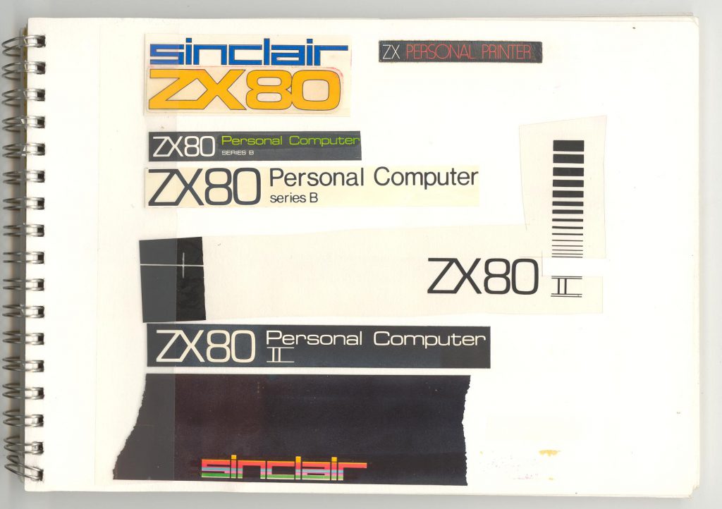
Rick: “Trying to figure out the boring graphics bit: what the ZX80 should be called and how that could look graphically. These are images done with letraset and a PMT camera, and it was evolving the ZX80 logo (at the top, done by John Pemberton) into the ZX81 logo. At that point in time the ZX81 did not have a name, hence the ‘II’ or ‘series B’ etc. The graphics bit is boring but crucial, and graphic designers don’t do product graphics very well, so you have to understand more about type and do it yourself. Their work is designing in 2D and applied mostly onto white paper, not three-dimensional forms of varying materials.”
Getting Started
By the time Rick began working for Clive Sinclair, at 6 King’s Parade, the company was named Science of Cambridge, soon to be renamed Sinclair Research Ltd. Rick’s first job was aiding John Pemberton with the industrial design of the ZX80.
“By then it was pretty advanced,” recalls Rick. “They were making the tools for the mechanical parts but hadn’t made the circuit boards so I helped with the PCB tape master. PCBs were laid out by hand on a 4:1 scale. I thought “This is exciting; I’ve laid out some of the tracks for the ZX80!” That was fascinating.
“John also produced the drawing for the PCB and designed it. Even today, people are shocked when I say ‘We’ll be designing your PCB profile; where the connectors go, and how it related mechanically to everything else.’ People just think you are a stylist and your work is this gratuitous thing that is applied to a product after the engineers have done the rest. But the industrial designer has his nose into everything because he has to know everything that is going on, certainly at a conceptual level, and then later on in quite a high level of detail.
“John was producing all the mechanical design solutions, which meant designing anything that was needed but couldn’t be bought, so that included things like the heat sink, for example. He’d decide on the shape of the heat sink and where to locate the hole with which it would be fixed to the board. He’d also have to work out how it would fit with the case, designed all the case parts, the keyboard, the graphics, and how it was all to be manufactured. When John had gone I took over getting those bits into production.”
Marketed as the first affordable home computer and launched in February 1980, the ZX80 was undoubtedly a groundbreaking product. It sold in kit form or fully assembled, was remarkably compact and had a waterproof membrane keyboard. For Rick, it was an abrupt introduction to the world of computer design and mass production issues.
“I had taken over John’s office,” recalls Rick, “and had become familiar with the working of the Eagle pub, hearing coal being scraped at 10.30 in the morning, ready for lunchtime opening hours. Clive came in one day and said ‘Don’t worry; we are going to do another product soon.’ I think he was concerned that I was getting bogged down with production. Of course, I knew nothing about production but was learning pretty quickly with the ZX80. There are always problems with the production of something new, just trying to get things to do what they are supposed to.
“We weren’t using especially precise manufacturing methods just because I don’t think the company had enough money at the time to do anything like that. But my first design task was something as mundane as a ZX80 RAM pack using the dreaded vacuum forming process. But after that I got onto the ZX81.
“When Clive started talking about it we were thinking of making it out of metal. The Sinclair Sovereign calculator was pressed out of metal and there were aluminium, gold, and silver plated versions and even powder-coated and painted ones as well. Once you have the pressing tools made the case can be pressed it in quite a range of materials.
“At the time the Japanese where huge on immaculately produced, and intricate pressed, metal parts for their products, but in Europe we really were falling by the wayside when it came to getting precision, aesthetic-engineering quality into our products. Everything was just moulded and there is only so much you can do with moulding.
“The Japanese pressed their parts in the same way a car manufacturer would press a body part for a car, and pressed metal is so thin that it might be only half a millimetre thick or less. So they were producing products with very thin casing and we were competing with injection moulded plastics which were four or six times that thickness. When there is a top and a bottom and sides that adds up to a lot of extra space used up just with the casing.
“Apart from metal not taking up much space, it is cold to the touch, very rigid and doesn’t creak, so it’s nice in a tactile sense. By comparison, injection mouldings, with big fat screw bosses and Phillips head screws going into them, were pretty crude.
“Also, their metal pressings had such perfect-looking, immaculately-painted surfaces and the detailing of the holes, where a socket or button came through, was impressive. The button would be absolutely in the centre of the hole and the gap would be equal all the way round. You just couldn’t do that in the UK or Europe; it was impossible. We just didn’t have access to the manufacturing methods and you can only design for what the manufacturer can make.
“We pursued a metal casework for the ZX81 for quite a long time and spoke to the company which did the case for the Sovereign – they specialised in making nibs for fountain pens. But in the end we just went for injection moulding.
“I’d never done an injection moulding before. We’d learnt the principles in college but not well enough, so for references I used the TV1B which Dick Norman had designed. In the days, before I joined, when it was Sinclair Radionics, John Pemberton did the industrial design, but they had a whole drawing office working on the detailed design work – the casing, PCB profiles and so on – and I think Dick was the lead engineer. John didn’t get that involved. But by the time I joined Sinclair that department had gone so I had to do it all, which was good practice and I learnt a lot.
“So I went to the TV1B to see how to design plastic moulding. Like a lot of things, you never really look at them closely until you get interested. If you are buying a car, for example, and looking at a particular model, suddenly you notice there are a lot more of them. It’s just because you are looking and taking it in. So I was looking at things like how thick the plastic needed to be.”
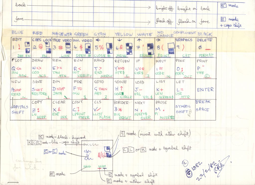
Rick: “Working out the ZX81 keyboard layout. There was too much data to put on the available space – but I decided that this had to be done before work could start on the physical deign of the product, as the keyboard is the data-entry device, and everything would grow from that. More interesting for the Spectrum as it had separate moving keys whereas the zx81 was a single surface .”
Please Release Me
One of the less obvious injection mould requirements Rick found he had to satisfy was the provision of adequate mould release draft. Rick explains what that means and the problems it and other injection moulding issues causes the designer.
“There are design rules for any manufacturing process. In injection moulding, it’s got to have mould release draft so you have to work out how much you need and the consequences of the process limitations.
“Even if you have a simple form, like an open square box, the sides of that box have to be tapered otherwise it won’t come off of the mould tool. And the coarser texture you have on the outside of the box, the more taper you have to have.
“It becomes more complicated if you want to mould a hole half-way up the side of the box. You can’t have something sticking out because that would prevent the part from coming out of the mould tool. So the only way you can mould the hole is to have a movable metal bit of the mould tool which pulls clear of the mould once it has created the hole. Then you can lift the part out. And even that movable part will have to have its own draft, but in the other axis!
“At Sinclair what we used to try and do was make sure all our holes occurred on the edges of the moulding, or what we called the shut face. In other words, if you have a top and bottom of a case, you’d try to arrange for the socket holes to occur where the two parts join, because you don’t need complex tooling to achieve that. It’s what’s called in line of draw.
“I stumbled upon this problem straight away with the ZX81 because of the components that were inside. One hole had to be at one level and another at another level and there was no way they could be coincident because of what was going on inside. I though ‘Well, how do I do that then?’ So it’s a nightmare and then you have got to make it look nice as well!
“So there are the aesthetics to consider, of course, but also the practicality of making a part that not only serves all the design requirements, but can actually be manufactured. And you can’t delegate; you’ve got to know all this stuff.”
Clearly it is imperative that the industrial designer has a good relationship with anyone else contributing to the design, such as the electronics engineers who might be positioning outputs, so that the occurrences of certain features do not cause tooling problems later on. Nevertheless there will always be some things which cannot be moved for good reasons. Possibly because a part that’s been bought in rather than designed in-house, or when there is some kind of operational restriction such as a temperature or electro magnetic tolerance. A Rick puts it, “There are some things that just have to be like that and you have to accommodate them somehow.”
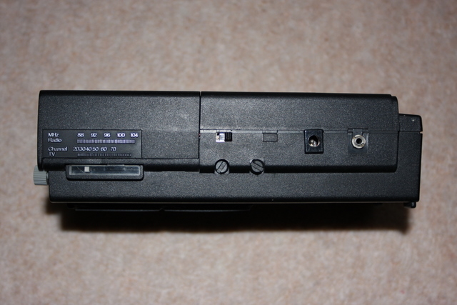
The TV1B edge (working pre-production model) with ‘in line of draw’ connectors and switches. Photo by Brian Flint
Putting It Together
Designing a product which is fit for purpose and comprises parts that a factory can manufacture properly and cheaply is important, but it is also imperative that the various parts can be assembled correctly, easily and quickly on the production line, otherwise production costs are likely to spiral.
“What you decide early on is going to absolutely force how you assemble the product so you have got to know exactly how you are going to assemble it,” continues Rick. “For example, you could be designing a mobile phone where size is always the enemy, or certainly used to be. There won’t be enough space to screw it together – it’s impossible – so you have got to use space-saving fixing devices. Snap fittings can be quite useful but snap fits are very complicated to design and tool up and they only operate in a certain direction. So you have got to think carefully about how you are going to assemble those parts and in what order the assembly occurs. And nowadays you have got very complex geometry with products and you just can’t separate some shapes. So we often make models very early on.”
Tantamount to a disaster would be to initiate the manufacture of some highly expensive moulding tools, only to discover that the design needs changing. Naturally a number of strategies and safety procedures exist to prevent such a thing from happening, as Rick explains.
“Right from the start you have strategies in place. You’ll have an electro magnetic compatibility, thermal management and assembly strategy. The procedures that you have in place on the design process are to check certain high risk things out. In the Sinclair days so, for example, you’d take a design to a particular level, then have a professional model made of it, just to check how things fit. That would still be at a very basic level, but if everything was OK, you’d evolve the detail further and further and keep making models.
“The lead time is enormous, whether you are using castings, mouldings or metal pressings. This is another problem because you’ve got to have your mechanical design completed before the electronics and everything else, which is really difficult. Quite often the electronic designers still don’t know all the parts that they’re putting inside at that stage, so you don’t know for sure if it is going to be large enough. You’ve got to make really good guesses and have slack and alternative ways of doing something if one of the components doesn’t work out.
“Tooling costs a lot of money. It is millions to tool up a mobile phone for high volume production, for example, so the risk is enormous. If you have got something wrong that is not easily fixable, or not fixable at all, then you have got to go back to the beginning. Worst case scenario, it could be a year to design that problem out and re-tool it.
“But there can be horrific oversights which is why prototyping is really important. And today we have prototyping methods which give you a pretty good idea of what the parts are going to look like, just within a few days. The tools available to you today are much better than what we had in the Sinclair days.”
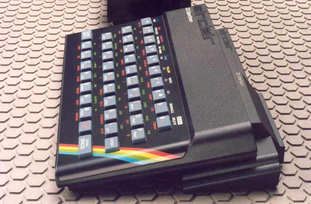
The Sinclair ZX Spectrum
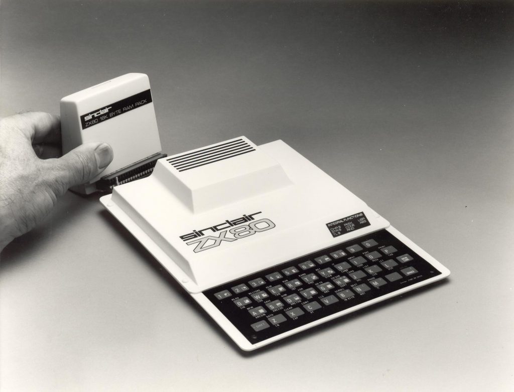
ZX80 with 16K RAM-pack expansion – Rick’s first Sinclair design task
Learning from the ZX81
The ZX81 was a successful product for Sinclair Research Ltd, and was the first product Rick had worked on from scratch. It had been a steep learning curve after John Pemberton’s swift departure, but Rick somehow managed to get through. He explains what he learnt from the experience.
“I learnt that you can’t design anything unless you know how to make it. It is so fundamental. It might sound simple but not many people design things knowing how they are going to make it.
“There’s a real beginning, middle and end to designing something. There are some parallel activities but it is very serial in other ways. There is definitely a way to start and a way not to start and it always shocks me that not many companies know that. You can see that when you see the mess they get into.
“So I learnt how difficult it was to design something for manufacture, where you are not just making one. It’s got to be repeatable and the repeatability has got to be sufficiently accurate so that it will still work. It’s easy to make one and get it working perfectly by spending hundreds of hours on it, but mass production changes things and makes it really difficult.
You have to design it so they can be made in the hundreds of thousands and one every 30 seconds. At first you think, ‘Well, it’s impossible isn’t it? How am I going to do that? I can’t spend hours on each one fiddling and tweaking and just getting it right where it’s slightly different to the one I made earlier.’
“That is what I found difficult: the designing of separate parts that you could manufacture as separate parts, and assemble together with all the other parts to perform in the way that you hope and expect, without there being any huge problems that you hadn’t thought about.
“I’ll give you an example of one on the flat screen TV80. What I didn’t know was that as the battery discharged it increased in thickness! Maybe I overlooked one simple number on the drawing – a +0.5 or -0.2 or something like that – but by the time I realized it was well progressed, and I was just very, very lucky that I’d almost allowed enough space for it, and if it did swell the design was such that it would just bend the plastic without you knowing.
“It is damn difficult because you need to know so much and process so many different things at the same time; and hold in your head so many variables. You are unable to make a decision because you have got dozens of variables floating around. You have to nail something down to hang everything on. But what is it going to be if they are all variables? And how do you prioritize when they all seem as important as one another?
“Gradually you get there though sheer logic; constantly addressing the issues of what it is that the product is going to do, how many are going to be made and what are the most important things.
“You have got to find something that is more important than everything else. If it is going to get hot, is that a really important thing? If it is a portable product and has to fit your pocket, the most important thing is size. If it is bigger than your pocket you don’t have a product, so what attributes relate to size? It might be the thickness of the material so you think about ways to package it. You might ask yourself how you can repackage the internal parts so that you can get it small enough to fit in a pocket. That could be a driving factor on something like that.
“Once you’ve decided on the most important thing you have just got to freeze it, and then you will discover that it allows you to make decisions about other things that are a sub-set of that thing. From there you start building up a picture.
“But you are always keeping a little flexibility there because it is a bit like being in a maze. You know you are going to arrive at a dead end sooner or later so you have got to be able to retrace your steps and come up with another solution. You’ve got to find out where the dead end started and what you need to change to get rid of that dead end. And it is constantly going round in circles.
“This is why it is so difficult to explain to someone. It can take five hours just to explain why you have done it a certain way – there are so many things to consider.” TF
Part 1 of this interview can be found here: Part 1
Part 3 of this interview can be found here: Part 3
Also see the interview with Sinclair electronics engineer, Brian Flint here: Part 1

